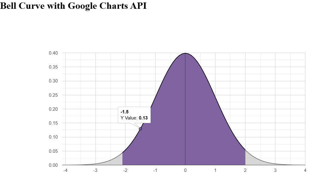
Bell Curve With Shaded Regions (Google Charts)

I built an interactive bell curve visualization using Google Charts API to display a normal distribution with customizable shaded regions. It leverages the jStat library for probability density calculations, allowing users to adjust mean, standard deviation, and shading bounds dynamically. The chart renders as an area chart with opacity styling for shading, providing a clear visual representation of statistical concepts like confidence intervals or hypothesis testing areas.
Problem / Context
Visualizing normal distributions is key in statistics education, but many tools are static or require complex setups. I needed a simple, embeddable web component to show a bell curve with shaded regions (e.g., for z-scores or p-values), adjustable via parameters, and rendered client-side without server dependencies.
Constraints / Goals
- Client-side only: no backend, pure JavaScript.
- Customizable: adjustable mean, std dev, x-range, shading bounds.
- Lightweight: minimal dependencies (Google Charts, jStat).
- Interactive: redraw on parameter changes.
- Accessible: semantic HTML, alt text for images.
Core Approach
Load Google Charts, set up a DataTable with x-values and y-values from jStat’s normal.pdf, style rows for shading based on x-range, and draw an AreaChart. Parameters control the data generation and styling.
Loading and Setup
google.charts.load("current", { packages: ["corechart"] });
google.charts.setOnLoadCallback(prepareChart);

function prepareChart() {
  data = new google.visualization.DataTable();
  setChartOptions();
  addColumns();
  addData();
  drawChart();
}
Chart Options
function setChartOptions() {
  options = { legend: "none" };
  options.hAxis = {};
  options.hAxis.minorGridlines = {};
  options.hAxis.minorGridlines.count = 5;
  return options;
}
Data Structure
function addColumns() {
  data.addColumn("number", "X Value");
  data.addColumn("number", "Y Value");
  data.addColumn({ type: "boolean", role: "scope" });
  data.addColumn({ type: "string", role: "style" });
}
Generating Data with Shading
function addData() {
  data.addRows(createArray(xMin, xMax, xLeft, xRight, mean, stndDev));
}

function createArray(xMin, xMax, xLeft, xRight, mean, stndDev) {
  let chartData = new Array([]);
  let index = 0;
  for (var i = xMin; i <= xMax; i += 0.1) {
    chartData[index] = new Array(4);
    chartData[index][0] = i;
    chartData[index][1] = jStat.normal.pdf(i, mean, stndDev);

    if (i < xLeft || i > xRight) {
      chartData[index][2] = false; // scope for shading
    }
    chartData[index][3] =
      "opacity: 1; color: #8064A2; stroke-color: black; ";

    index++;
  }
  return chartData;
}
Drawing the Chart
function drawChart() {
  chart = new google.visualization.AreaChart(
    document.getElementById("chart_div")
  );
  chart.draw(data, options);
}
Results / Impact
- Provides an interactive, accurate normal curve visualization.
- Shaded regions highlight areas like 95% confidence (e.g., -1.96 to 1.96).
- Easy to embed in educational pages or tools.
Trade-offs / Limitations
- Requires internet for Google Charts loading.
- jStat dependency for PDF calculations.
- Basic styling; advanced customizations need more options.
Next Steps
- Add sliders for real-time parameter adjustment.
- Support multiple distributions (t, chi-square).
- Export as image or SVG.
Tech Summary
Google Charts API, jStat for stats, JavaScript for data manipulation.
Summary Pattern Example
Problem: Need dynamic normal distribution visualization with shading.
Approach: Google Charts AreaChart with jStat PDF data and style roles.
Result: Embeddable, adjustable bell curve for statistics demos.